

Which colors are better for printing a postcard?
Postcards are a simple, easy way to get the word out. They don’t use a lot of paper, are less expensive than letters to mail, and done effectively can easily convey what you’d like to share in a visually pleasing, concise way. From advertisements to personal greetings and more, postcards are a great way to share your message.
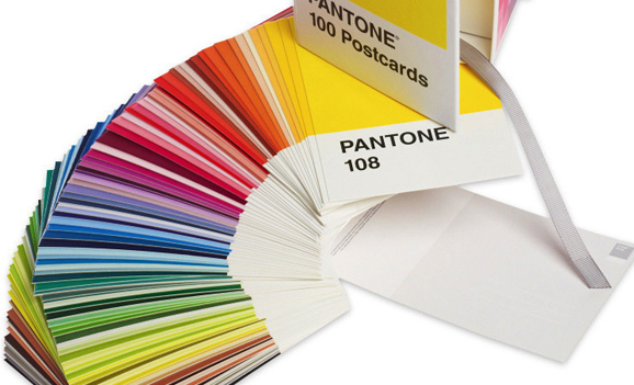
So, what are the best colors for printing a postcard? This will depend on just what your message is. Bold, strong colors, for instance, are great at catching the eye and delivering a powerful statement. To give your message a stronger pop, use colors that are opposites on the colors wheel: reds against greens, purples against yellows, blues against orange, and blacks against whites. Fluorescent and neon tones are often eye-catching as well, though you’ll want to balance your choices so as not to be too overwhelming or obnoxious.
Individual colors are also great at conveying specific messages: red is fiery and bold, blue can be calming and soothing, yellow is a peppy optimistic tone while purple is more regal and luxurious, and blacks are more sleek and sophisticated. If you want to tone down the intensity, paler shades of each of these will lighten their impressions. And glossy cardstock will help deliver those colors more accurately and cleanly, adding professionalism to your message. MSE by Sir Speedy has a wide choice of cardstocks to choose from.
When printing, you’ll want to also set your file to CMYK color mode instead of RGB, to better suit a professional printer. Make sure to check your final file to confirm the conversion still stays on message with what you’d like your postcard to convey.
